> ## Documentation Index
> Fetch the complete documentation index at: https://docs.omnifact.ai/llms.txt
> Use this file to discover all available pages before exploring further.
# Analytics
> Visualize how active your team is and how many messages have been sent over time with the Analytics dashboard.
## Track Team Adoption
The **Analytics** dashboard gives you a pulse on how your organization is using Omnifact. Visualize adoption trends, monitor message volume, and see how AI is becoming part of your team's daily workflow.
To access the dashboard, navigate to **Team Settings** and select **Analytics**.
 ### Understanding the Dashboard
The dashboard offers several key components to help you analyze team activity.
If you need to manage the users contributing to these stats, visit the [User Management](/en/platform/team-administration/users) page. For credit consumption related to this usage, check [Billing & Usage](/en/platform/team-administration/billing).
At the top right, you can select a specific date range to focus your analysis on a given period.
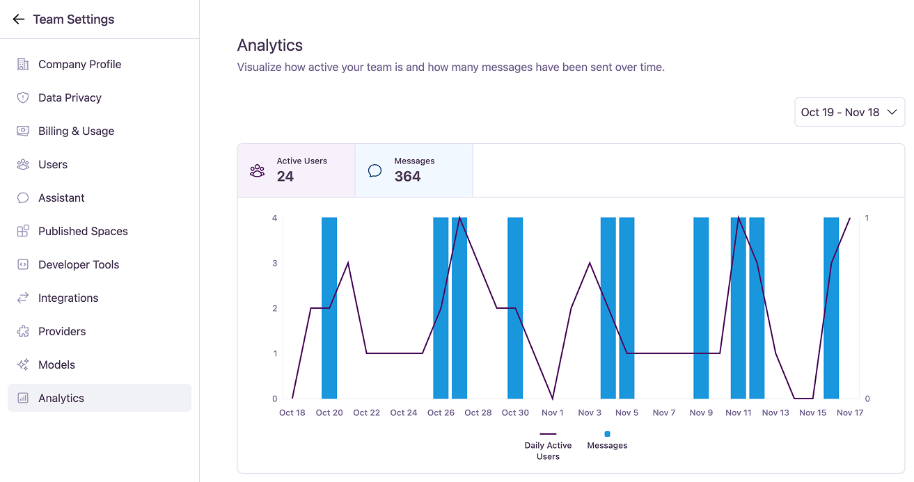
Above the chart, summary cards display the total number of **Active Users** and **Messages** for the selected date range.
These cards also act as interactive toggles. Click on a card to show or hide its corresponding data series on the chart below, allowing you to focus on a single metric.
The main chart visualizes daily trends. Hovering over a specific day on the chart will provide detailed numbers for that day.
* **Daily Active Users:** A line graph shows the number of unique users who were active each day.
* **Messages:** A bar graph shows the total number of messages sent by the team each day.
You can click the summary cards to toggle the visibility of each metric on the chart.
All data is presented in your local timezone, giving you an accurate view of your team's workday.
### Understanding the Dashboard
The dashboard offers several key components to help you analyze team activity.
If you need to manage the users contributing to these stats, visit the [User Management](/en/platform/team-administration/users) page. For credit consumption related to this usage, check [Billing & Usage](/en/platform/team-administration/billing).
At the top right, you can select a specific date range to focus your analysis on a given period.
Above the chart, summary cards display the total number of **Active Users** and **Messages** for the selected date range.
These cards also act as interactive toggles. Click on a card to show or hide its corresponding data series on the chart below, allowing you to focus on a single metric.
The main chart visualizes daily trends. Hovering over a specific day on the chart will provide detailed numbers for that day.
* **Daily Active Users:** A line graph shows the number of unique users who were active each day.
* **Messages:** A bar graph shows the total number of messages sent by the team each day.
You can click the summary cards to toggle the visibility of each metric on the chart.
All data is presented in your local timezone, giving you an accurate view of your team's workday.